Erik Kroes ✅ on Nostr: 😬 This trend is just so counterintuitive. If you want to emphasise something, why ...
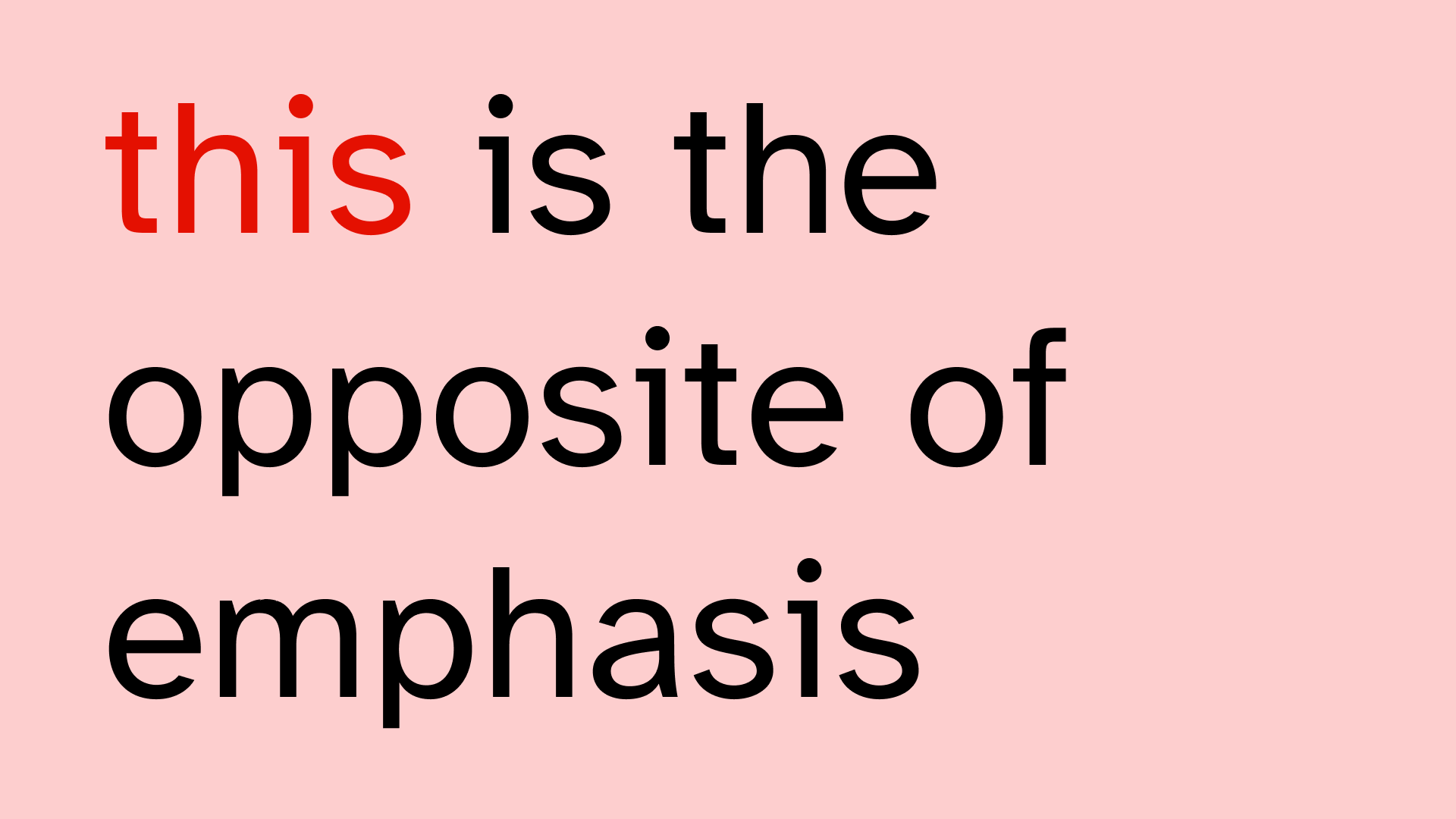
😬 This trend is just so counterintuitive.
If you want to emphasise something, why do you -lower- the contrast?
I see this way too often. Also in states of ui components for example. If something becomes -more- important, -increase- the contrast.
🧠 Or at least don't lower it.
Published at
2026-05-19 09:18:43 UTCEvent JSON
{
"id": "14e362d4e7b6c3ab54e53c8c25f11b997601367f55233346f20744772939709e",
"pubkey": "d66f54cef071e6b0b8a5a2581cfefe6db4478c790c7001ff862dc1b511d72bbd",
"created_at": 1779182323,
"kind": 1,
"tags": [
[
"imeta",
"url https://files.mastodon.social/media_attachments/files/116/600/492/697/013/800/original/f07b5cc2818a0924.png",
"m image/png"
],
[
"proxy",
"https://mastodon.social/@erikKroes/116600492738331606",
"web"
],
[
"proxy",
"https://mastodon.social/users/erikKroes/statuses/116600492738331606",
"activitypub"
],
[
"L",
"pink.momostr"
],
[
"l",
"pink.momostr.activitypub:https://mastodon.social/users/erikKroes/statuses/116600492738331606",
"pink.momostr"
],
[
"-"
]
],
"content": "😬 This trend is just so counterintuitive.\n\nIf you want to emphasise something, why do you -lower- the contrast?\n\nI see this way too often. Also in states of ui components for example. If something becomes -more- important, -increase- the contrast.\n\n🧠 Or at least don't lower it.\nhttps://files.mastodon.social/media_attachments/files/116/600/492/697/013/800/original/f07b5cc2818a0924.png\n",
"sig": "7d89f7444fd508fcf1f3aaa76d83060f52fa3f69cc1ebc9b13568acab0defd85e36752445a64cd725e7425ded4bab4c1b4e9c70b7b3482445cb9800de8e97cc9"
}